Gusto rebrand
Senior designer — 2019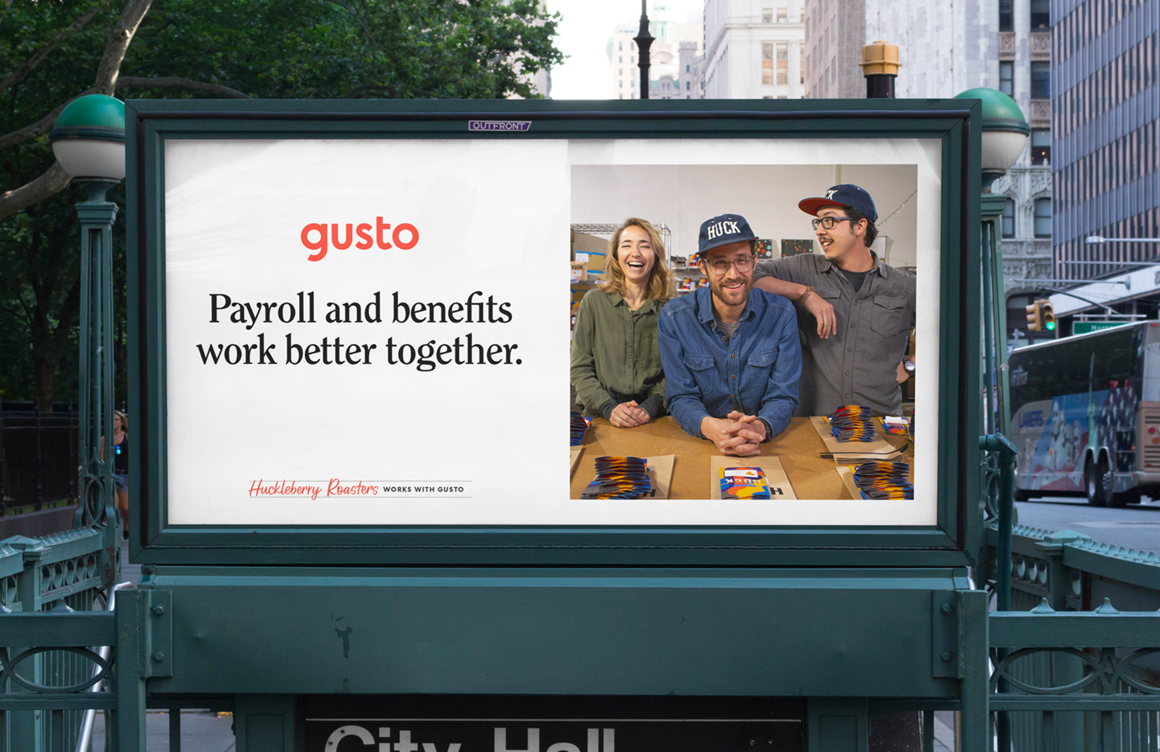
Celebrating humanity at work
Gusto is the one place modern employers can go to onboard, pay, insure, and support their hardworking teams. Gusto supports over 100,000 small businesses across the United States. Those customers are at the core of the company’s mission. Gusto rebranded in 2019 to create a people-centric brand that embraces what it means to be human at work.
I had the opportunity to work on the team that reimagined the company’s mission, strategy and visual identity. Our goal was to create a brand system that was scalable, differentiated, warm, and sophisticated.
I helped lead the visual direction of our rebrand by teaming up with a small task force of copywriters, designers and strategists.
I helped lead the visual direction of our rebrand by teaming up with a small task force of copywriters, designers and strategists.
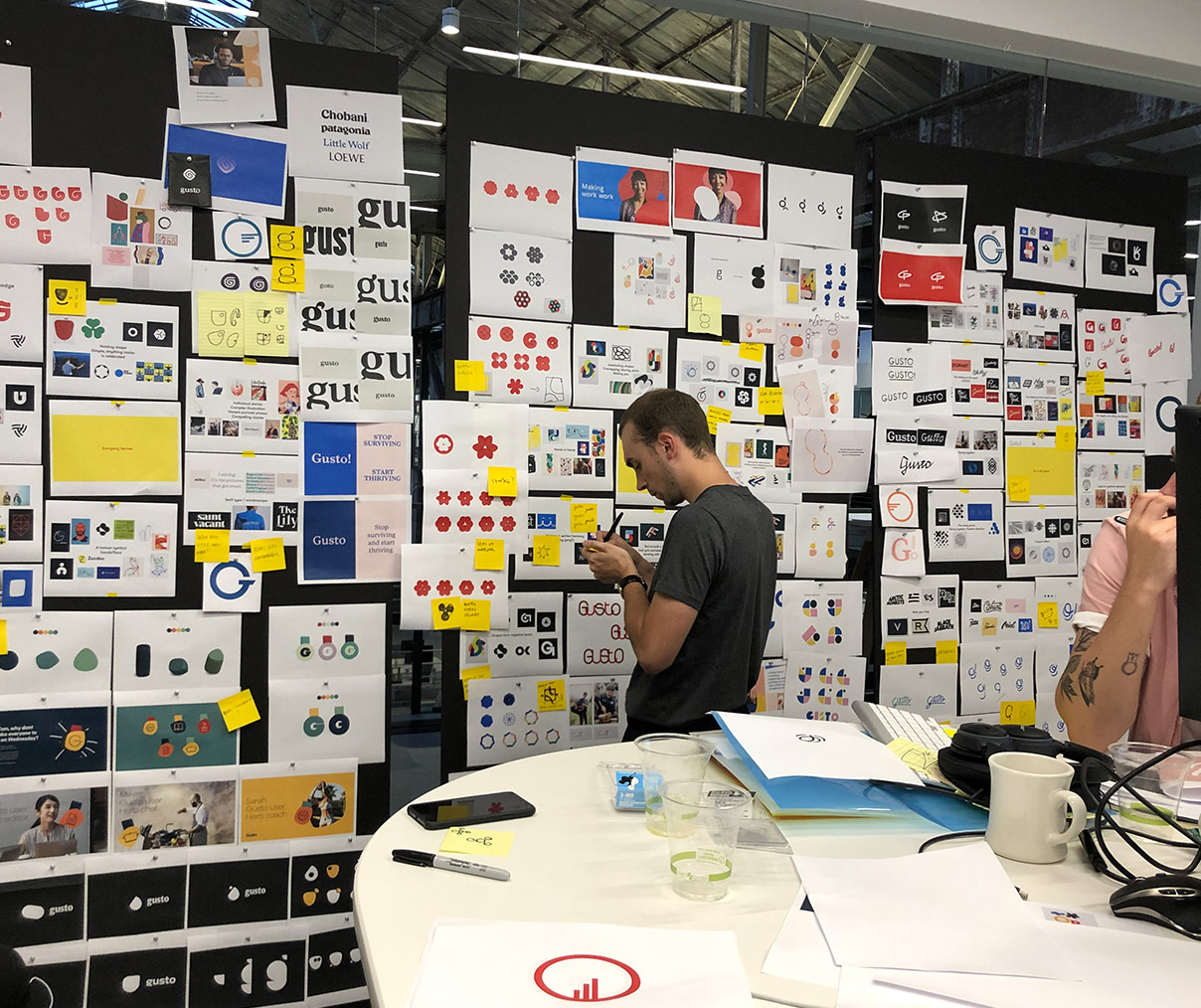
Early visual design explorations
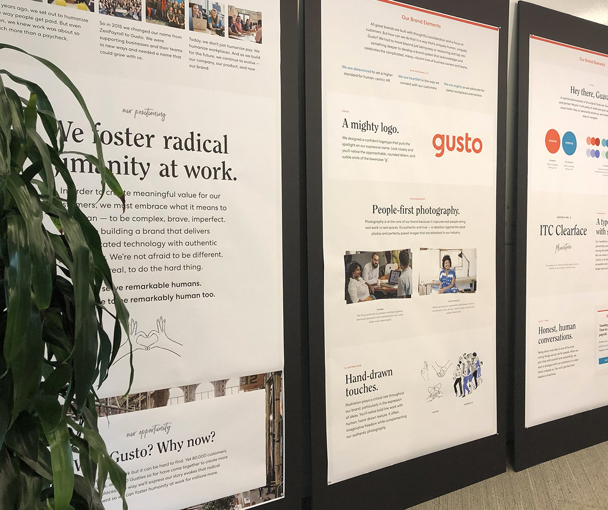 A shot of the “drops” from our stakeholder reviews
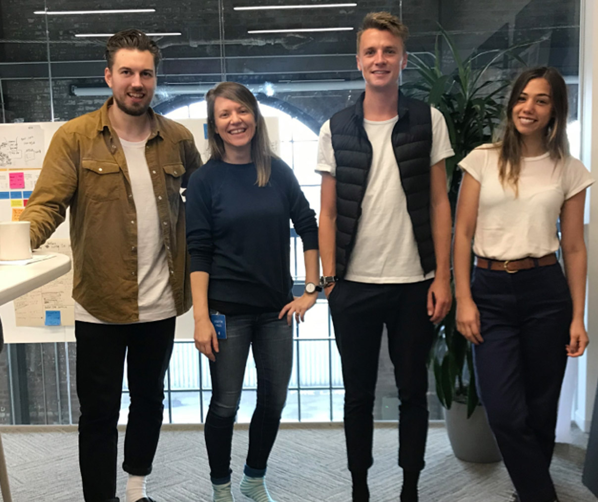
Just palin’ aroung
Brand positioning
We knew that establishing an insights-driven and authentic brand positioning was a crucial first step in creating a long-lasting brand.
An early insight that emerged from interviews with dozens of small businesses owners was that they care about their people. They want to celebrate their teams by providing more than just fair compensation. They want to inspire, foster growth, and create a great culture.
An early insight that emerged from interviews with dozens of small businesses owners was that they care about their people. They want to celebrate their teams by providing more than just fair compensation. They want to inspire, foster growth, and create a great culture.
Based off of that insight, we can up with our new brand positioning: We foster humanity at work. We want our brand to tell the full story of what it means to be human at work. That means celebrating heroic moments, as well as difficult ones. Our brand tells the story of real people who inspire us and the incredible things that happen when we work together.
Early explorations
Armed with a clear understanding of our users and our brand positioning, a small task force of designers and copywriters came together to explore the visual design system.
For two weeks, we looked at type, color, logo concepts, and art direction to explore how these elements could come together to form our new brand. At key moments, we presented the work to stakeholders in the form of “drops”—large panels that narrate the key components of our brand: strategy, visuals elements, and executions.
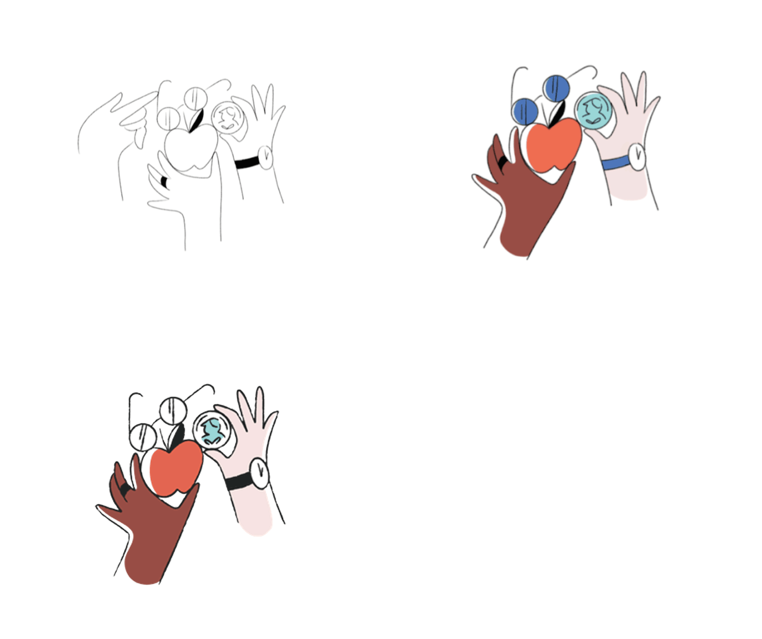
Art direction of illustrations by Meredith Schomburg
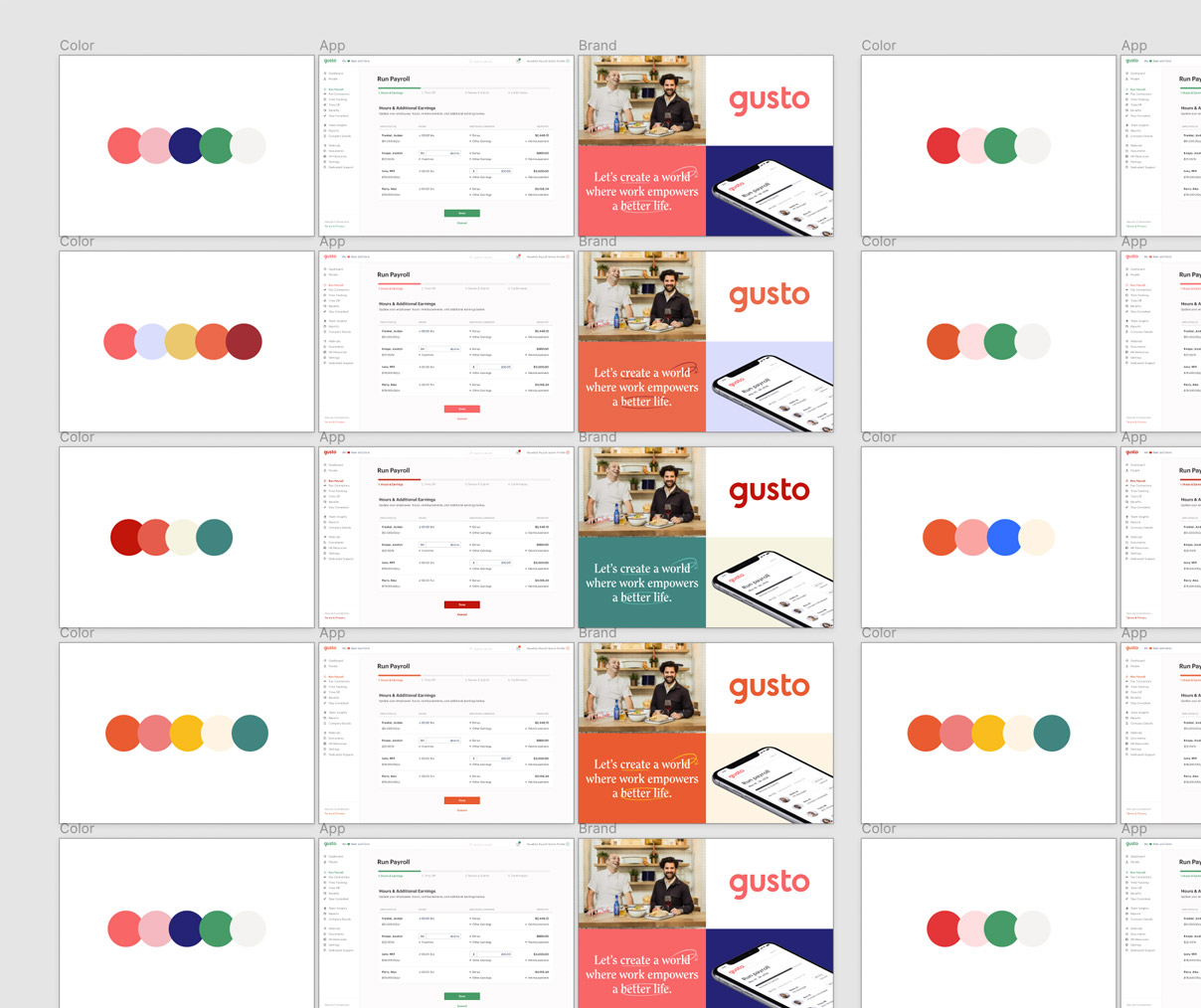
Exploring color palettes
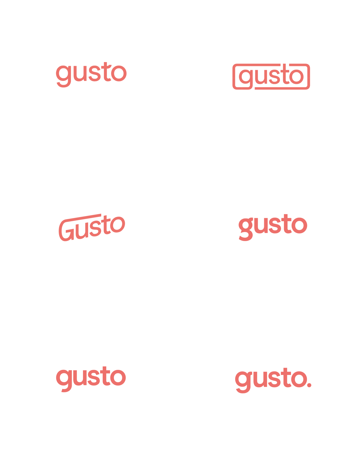
Early logo mark explorations
Brand guidelines
The visual directions I’d explored had a large impact on the final creative direction. Me and the rest of the brand team spent the next several months defining six key brand elements: logo, color, typography, art direction, illustration, voice and tone.
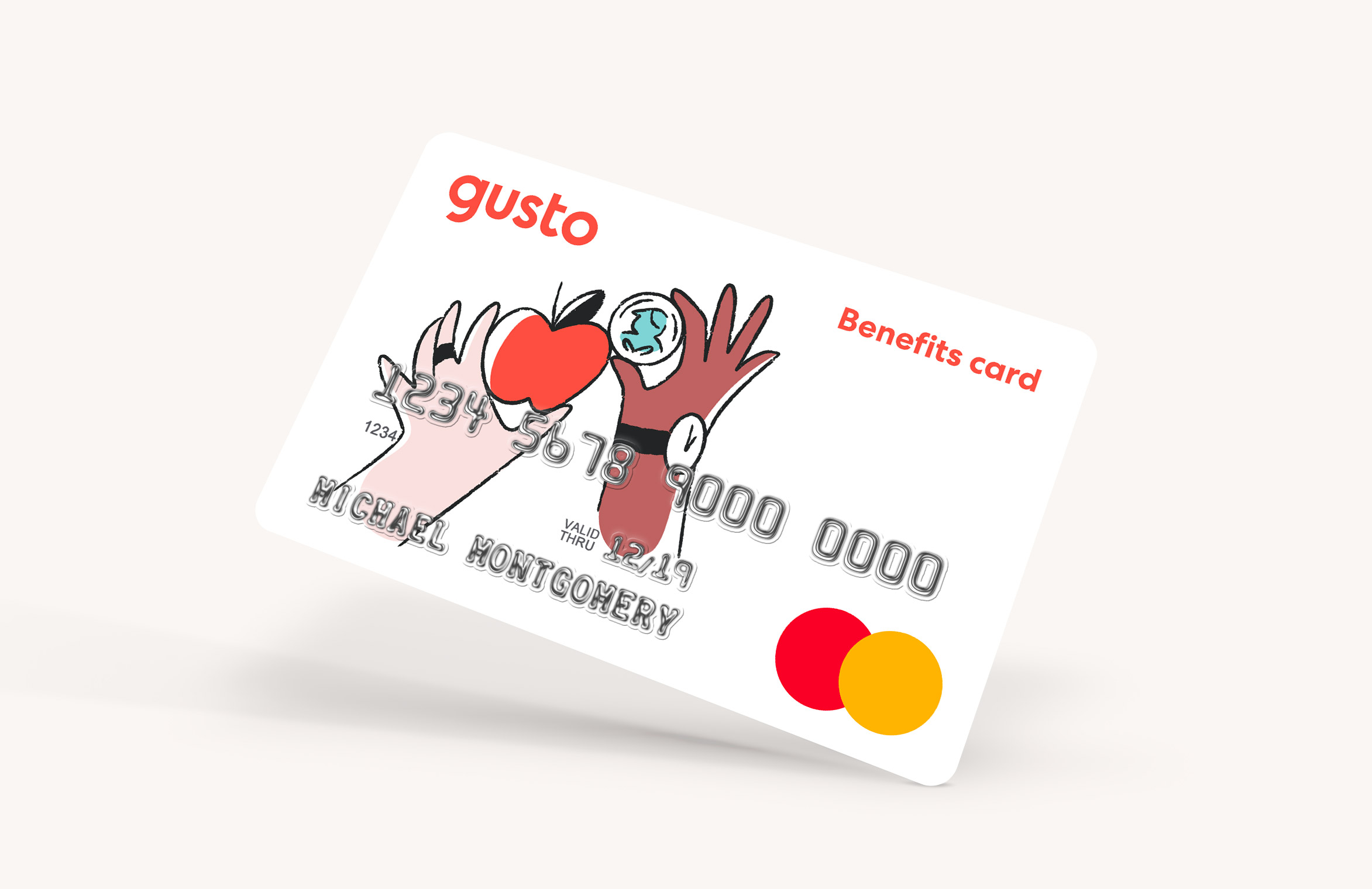
The result of those efforts was a comprehensive brand guideline created for designers and non-designers within Gusto. We provided assets and guidelines for how the brand should be used in different contexts.

Seeing it all come together

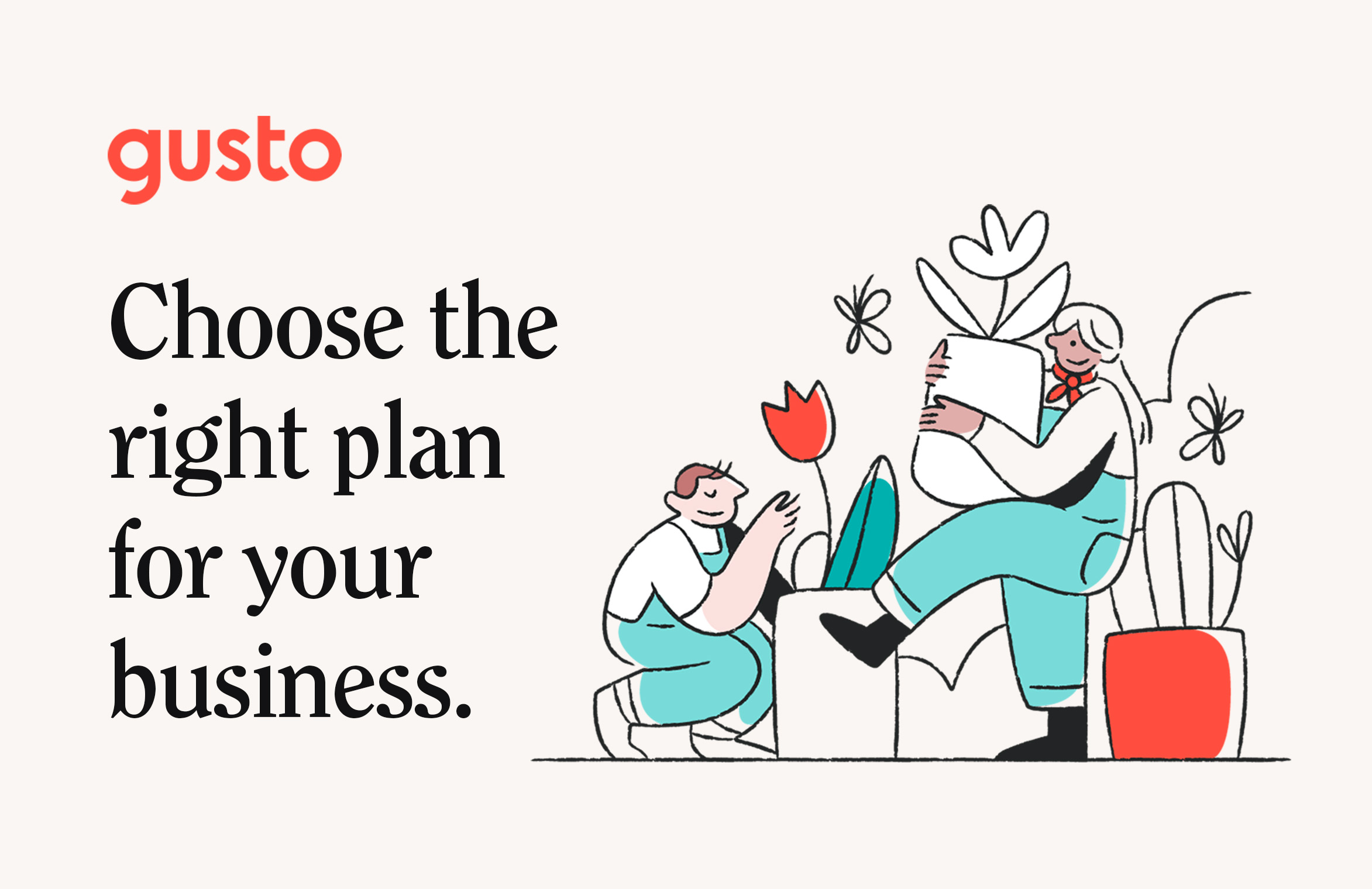
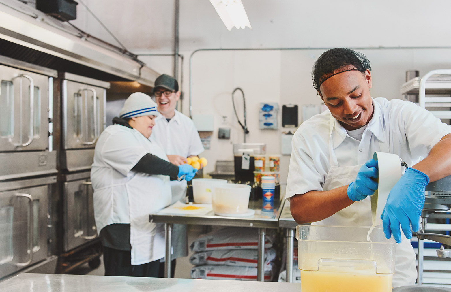

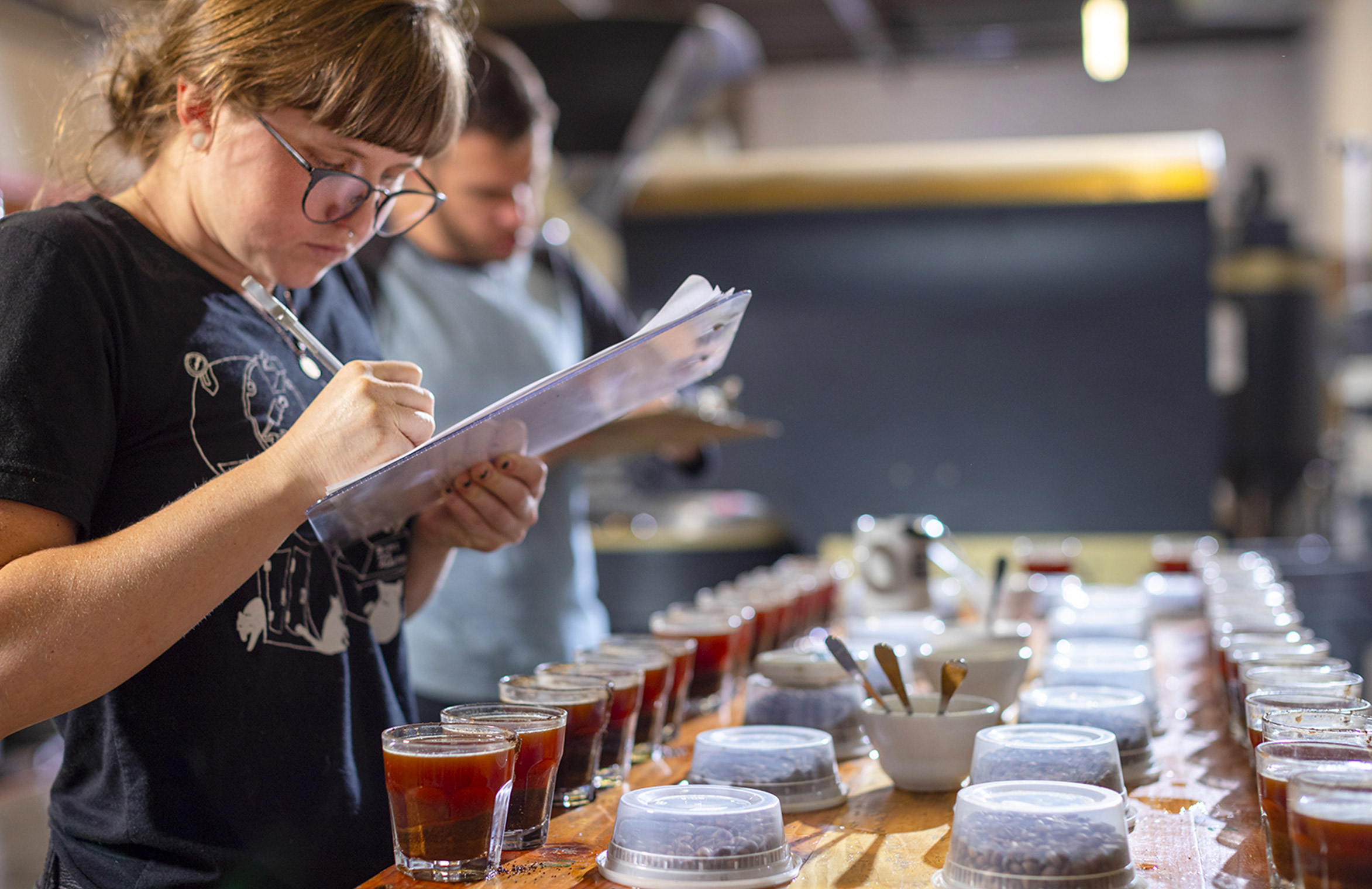
Credits:
Micah Panama—Creative Direction
Ellen Ennes—Copywriting
Koto—Visual exploration and illustration
Jenna Carando—Logo and photography art direction
Micah Panama—Creative Direction
Ellen Ennes—Copywriting
Koto—Visual exploration and illustration
Jenna Carando—Logo and photography art direction
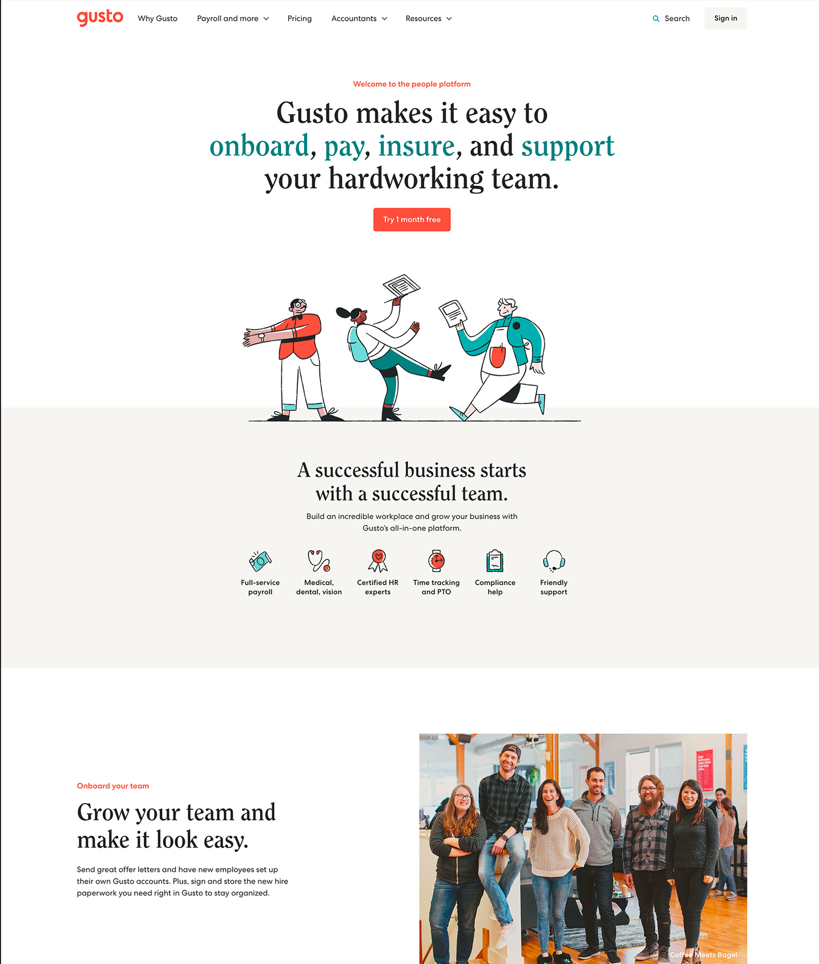
Gusto.com redesign
Lead designer — 2019See it live: gusto.com
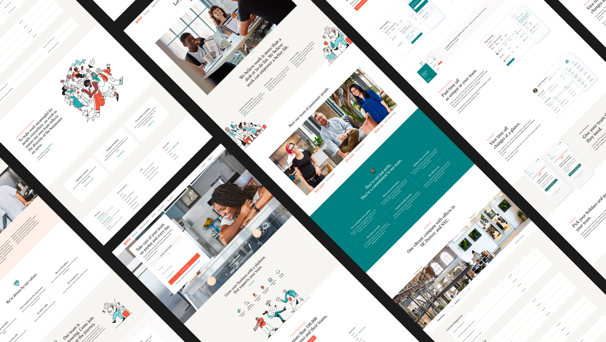
Redesigning gusto.com
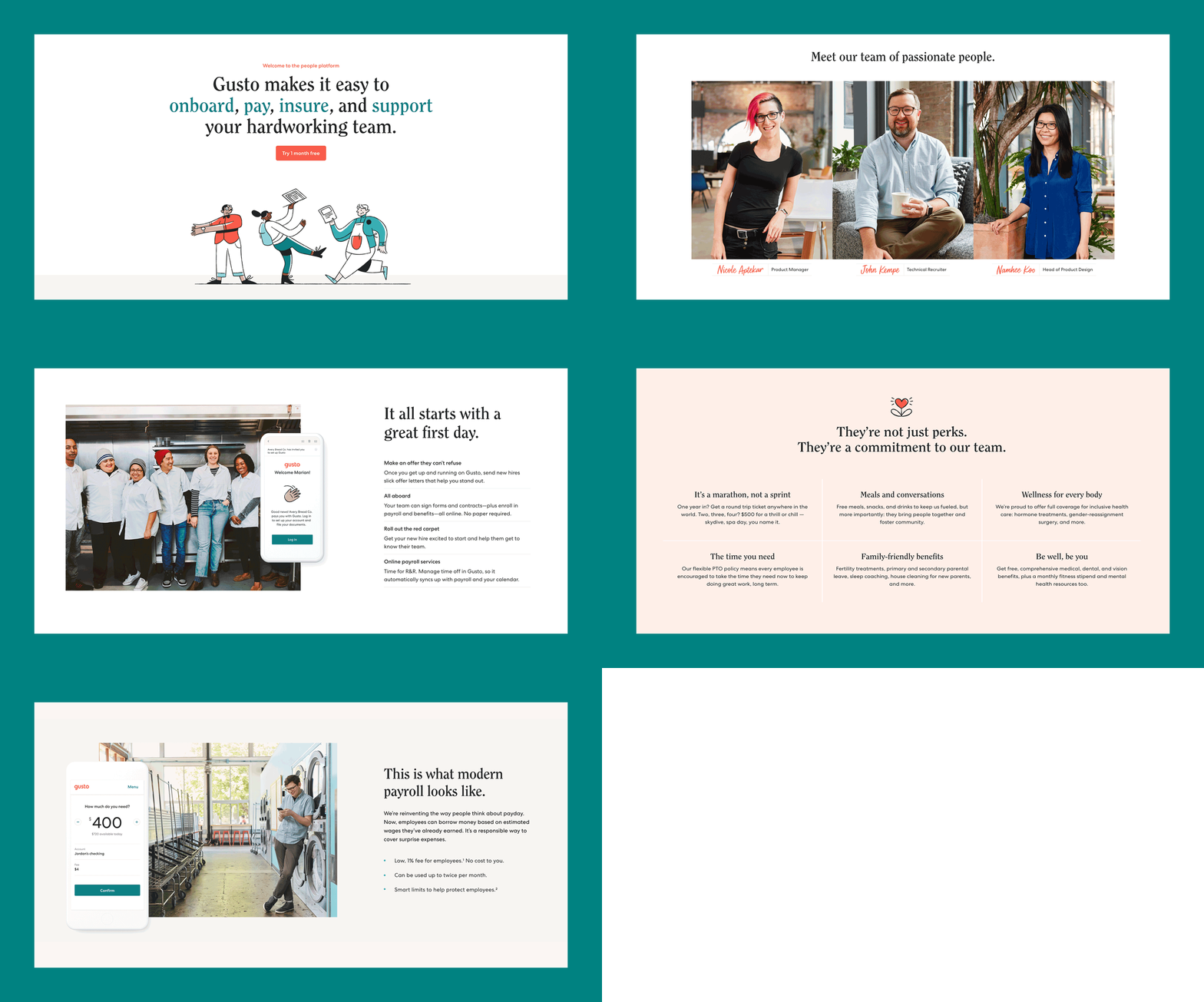
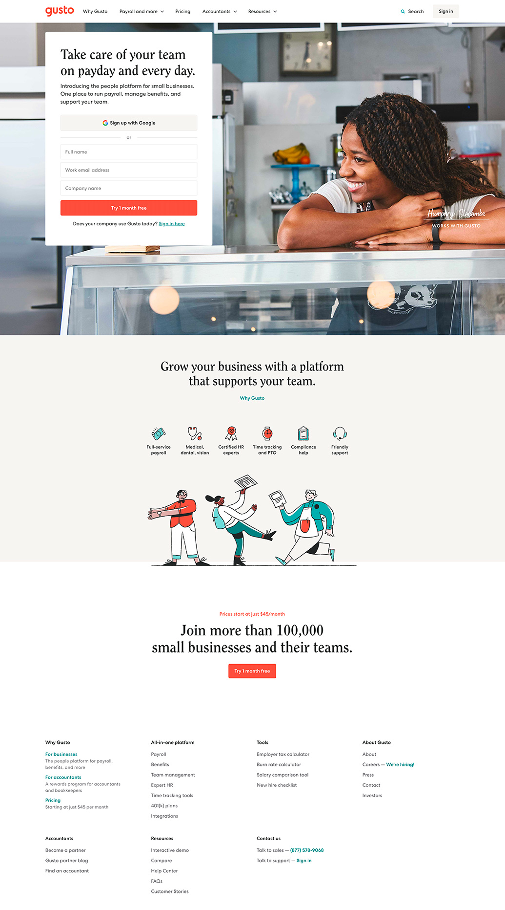
Gusto.com is one of the most visible touch points for our brand. It’s where millions of our customers, job candidates, and shoppers go to learn more about the company and to sign into the product.
I led a project to redesign gusto.com as apart of Gusto’s rebrand. My role was to lead the team through the phases of the design process, establish our design system, and partner cross-functionally on strategy and implementation.
I led a project to redesign gusto.com as apart of Gusto’s rebrand. My role was to lead the team through the phases of the design process, establish our design system, and partner cross-functionally on strategy and implementation.
We scoped the project around these three goals:
- Create a new digital design system to reflect our new brand identity.
- Rethink the narrative of 10 key pages of the website based off of our new product positioning.
- Maintain conversation rates for visitors and customers.
Early prototyping and wireframes

A review session

Early wireframe explorations
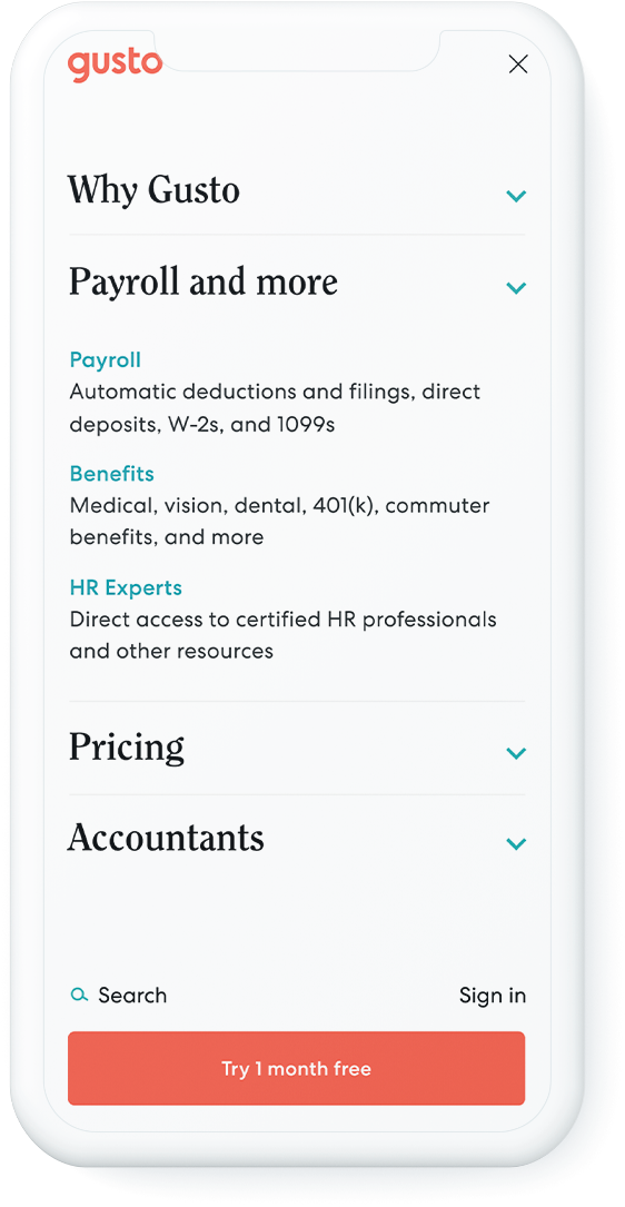
Before considering visual design, we defined the UX and information architecture of the website. These decisions helped inform some key navigational elements of gusto.com, such as the sitemap and nav bar.
With that foundation in place, we were well-positioned to explore the narrative and user experience of individual pages through wireframing. During this process, we partnered closely with product marketers and copywriters.
Defining our design system
Early visual design explorations
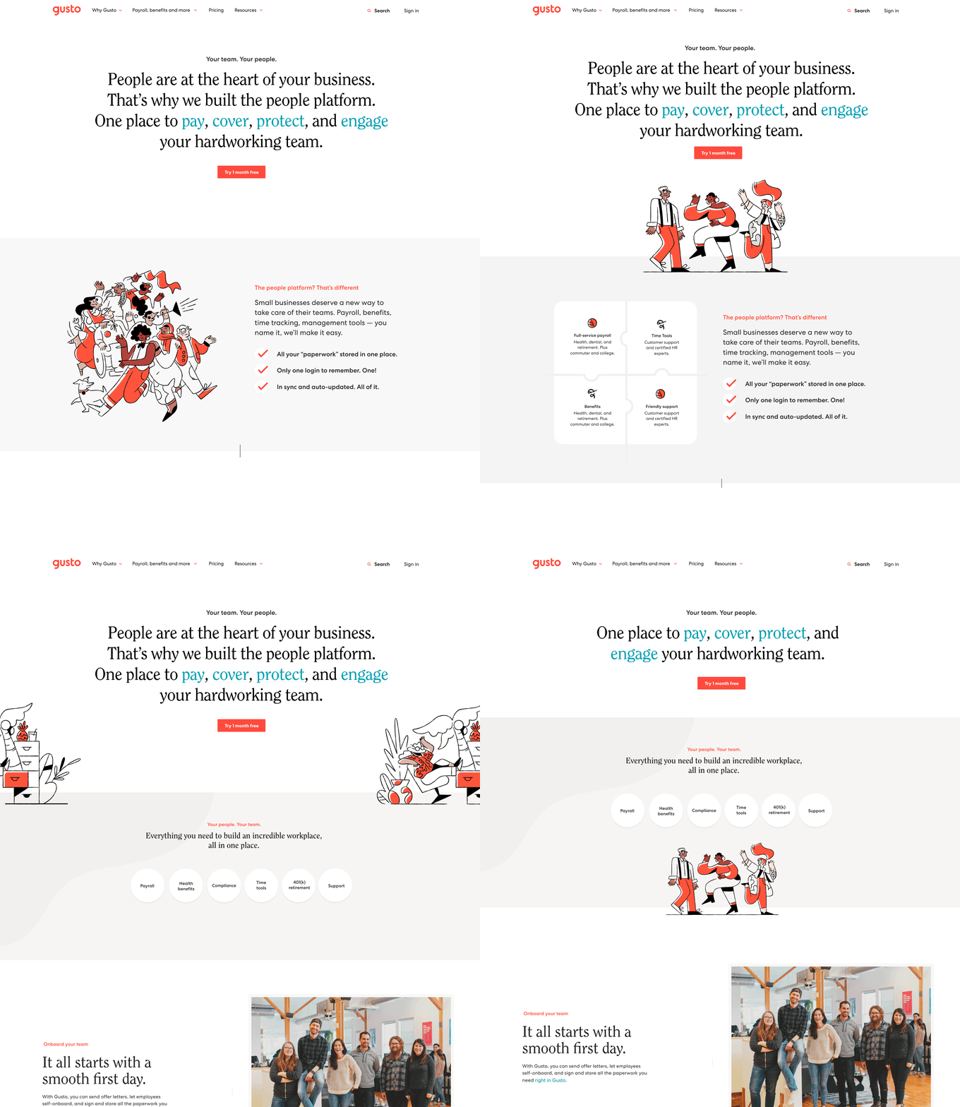
We next began exploring the visual design of our new brand’s website. While the major elements of our new brand were defined (color, typograpghy, and logo) there was still ample room to define how they worked together in an interactive environment.
Throughout this exploratory phase, design trends and patterns began emerging. I documented our nascent design system in Figma and worked with engineering to build out a component library in our code base.
Throughout this exploratory phase, design trends and patterns began emerging. I documented our nascent design system in Figma and worked with engineering to build out a component library in our code base.
I worked closely with, Jason Marder on our design systems team to ensure that elements were consistent across brand and product.
These systems enabled the team to stay aligned on design developments and streamlined our workflow.
These systems enabled the team to stay aligned on design developments and streamlined our workflow.
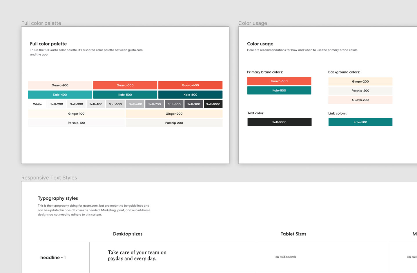
The Figma design system I created for the brand team
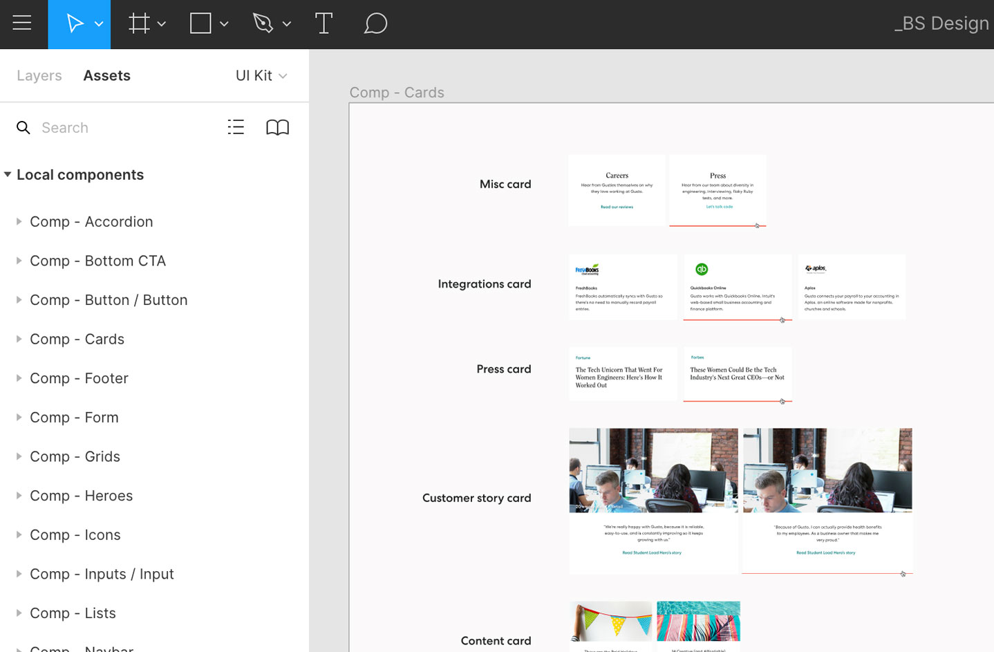
The Figma component library I created for gusto.com elements.
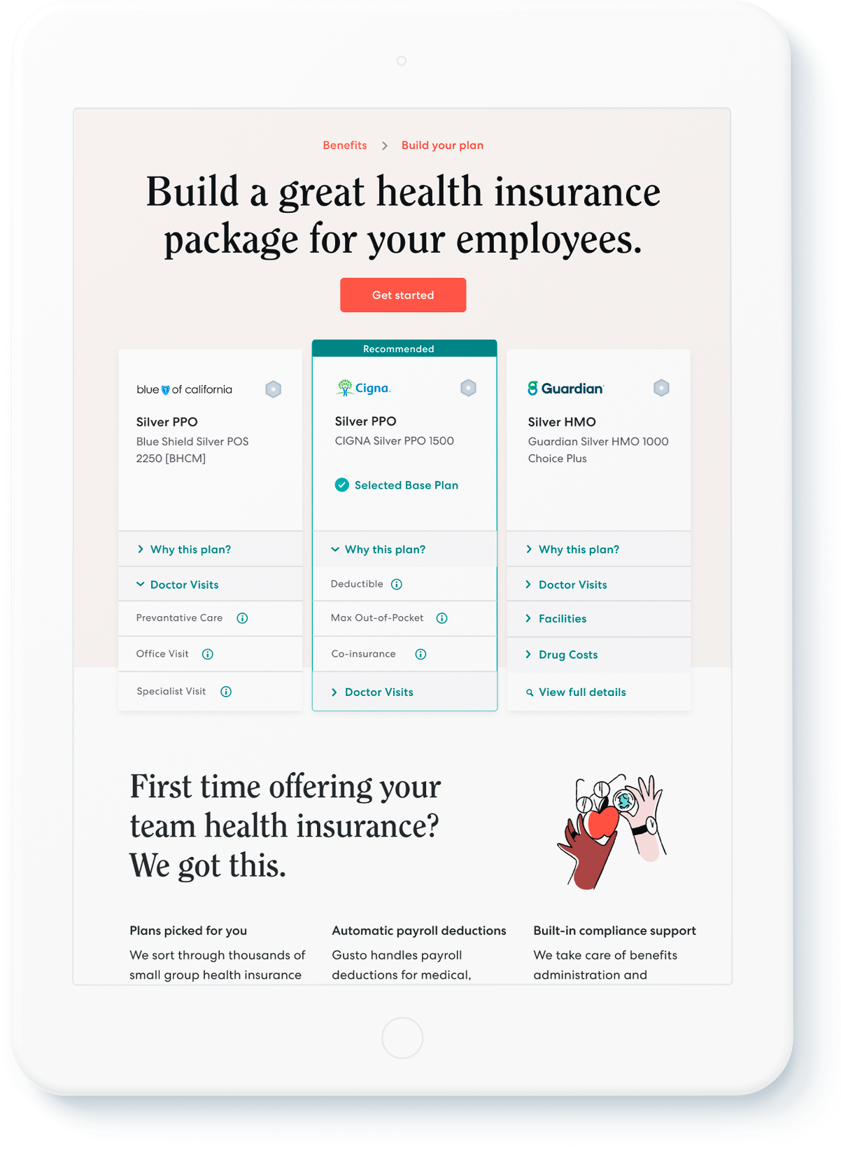
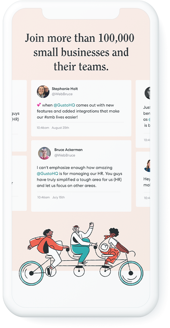
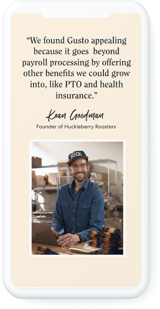
The finished product ✨



Credits:
Micah Panama—Creative Direction
Ellen Ennes—Copywriting
Lindsay Grizzard—Designer
Jason Marder—Design systems
Micah Panama—Creative Direction
Ellen Ennes—Copywriting
Lindsay Grizzard—Designer
Jason Marder—Design systems
Dipsea
UX and Visual design — 2019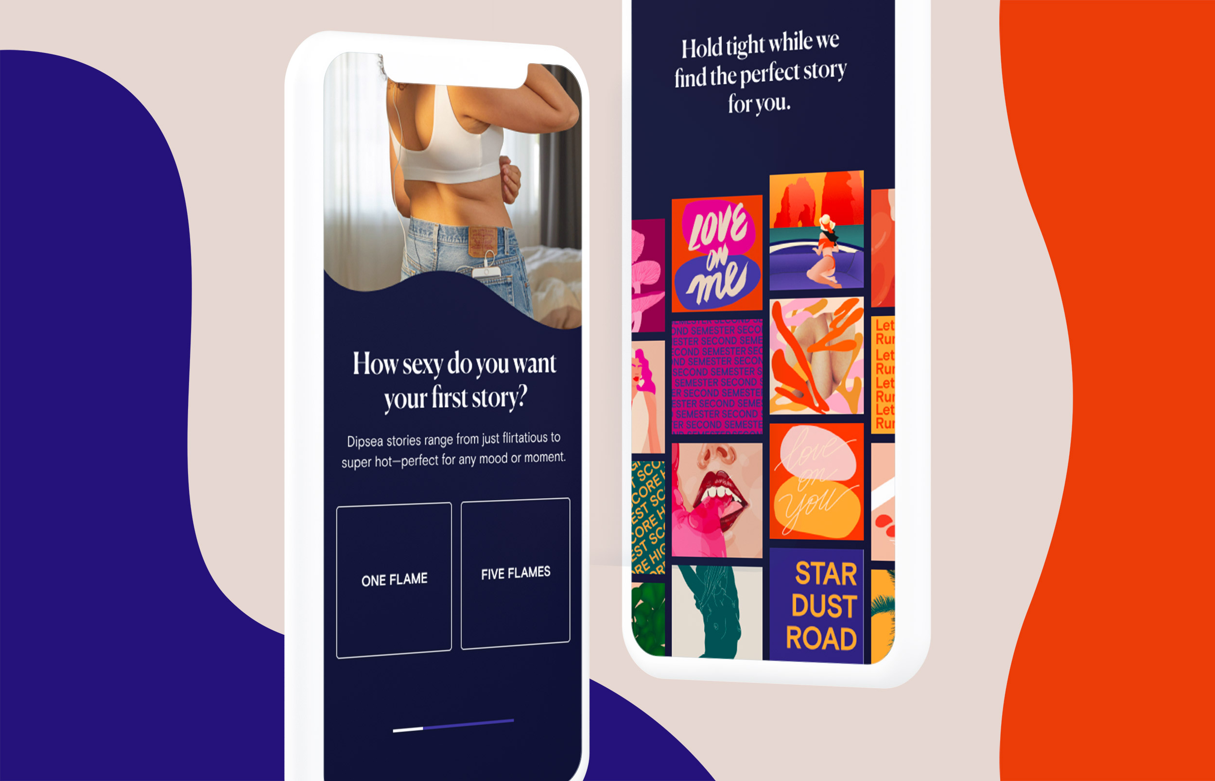
Redesigning Dipsea’s onboarding flow
Dipsea is the first audio platform for sexual wellness. It provides short and sexy audio stories made for women. I worked with the Dipsea team to create an onboarding experience for new users and trial subscribers.
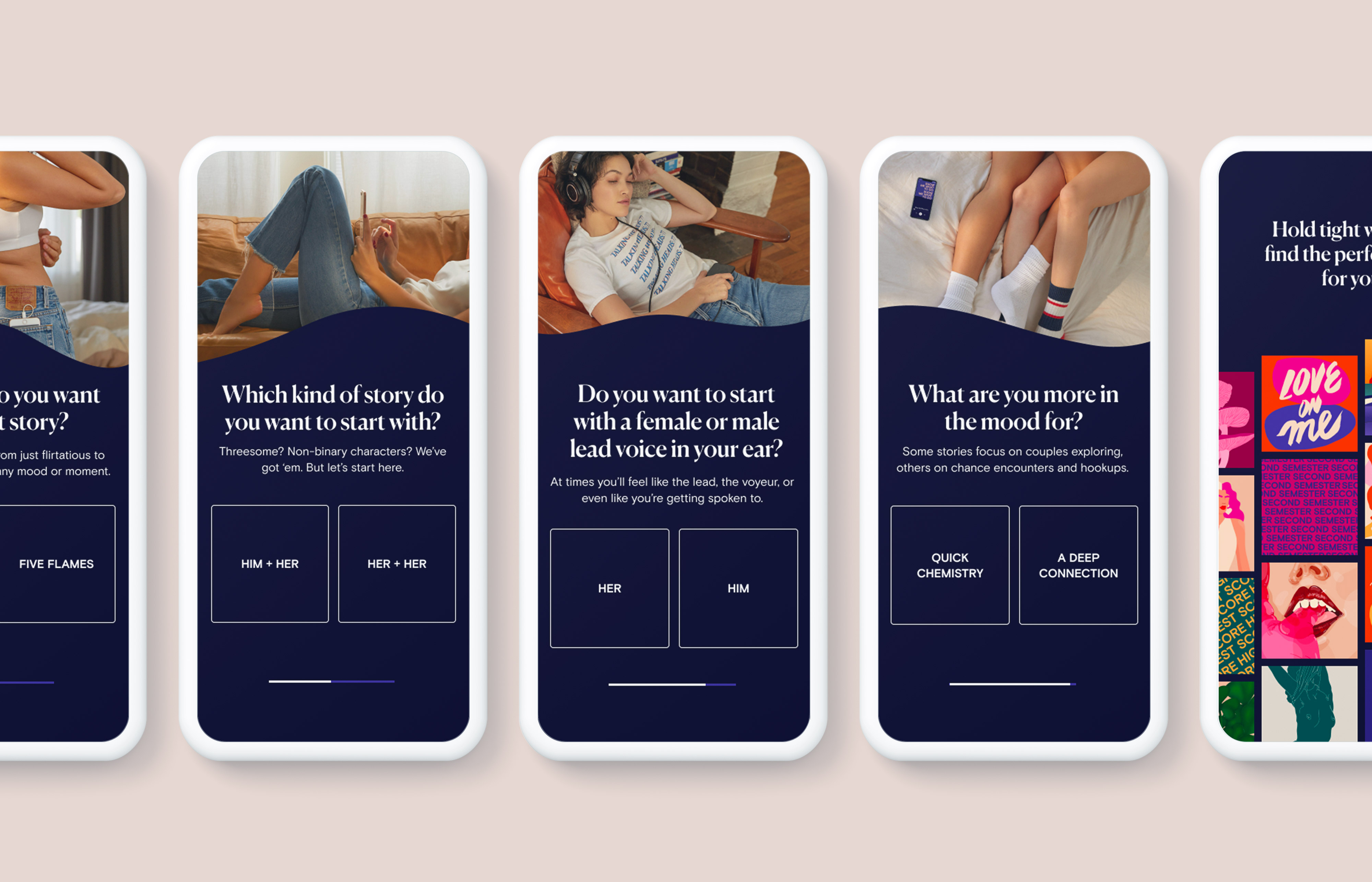
The goal of the onboarding flow was to educate users, create a high-touch and personalized experience, and increase content discoverability.
By asking users to answer four simple questions about themselves, we were able to recommend a story personalized to their tastes and preferences.
By asking users to answer four simple questions about themselves, we were able to recommend a story personalized to their tastes and preferences.

Credits:
Gina Gutierrez—Co-founder
Faye Keegan—Co-founder
F&B: Voices from the Kitchen
Art direction and design — 2019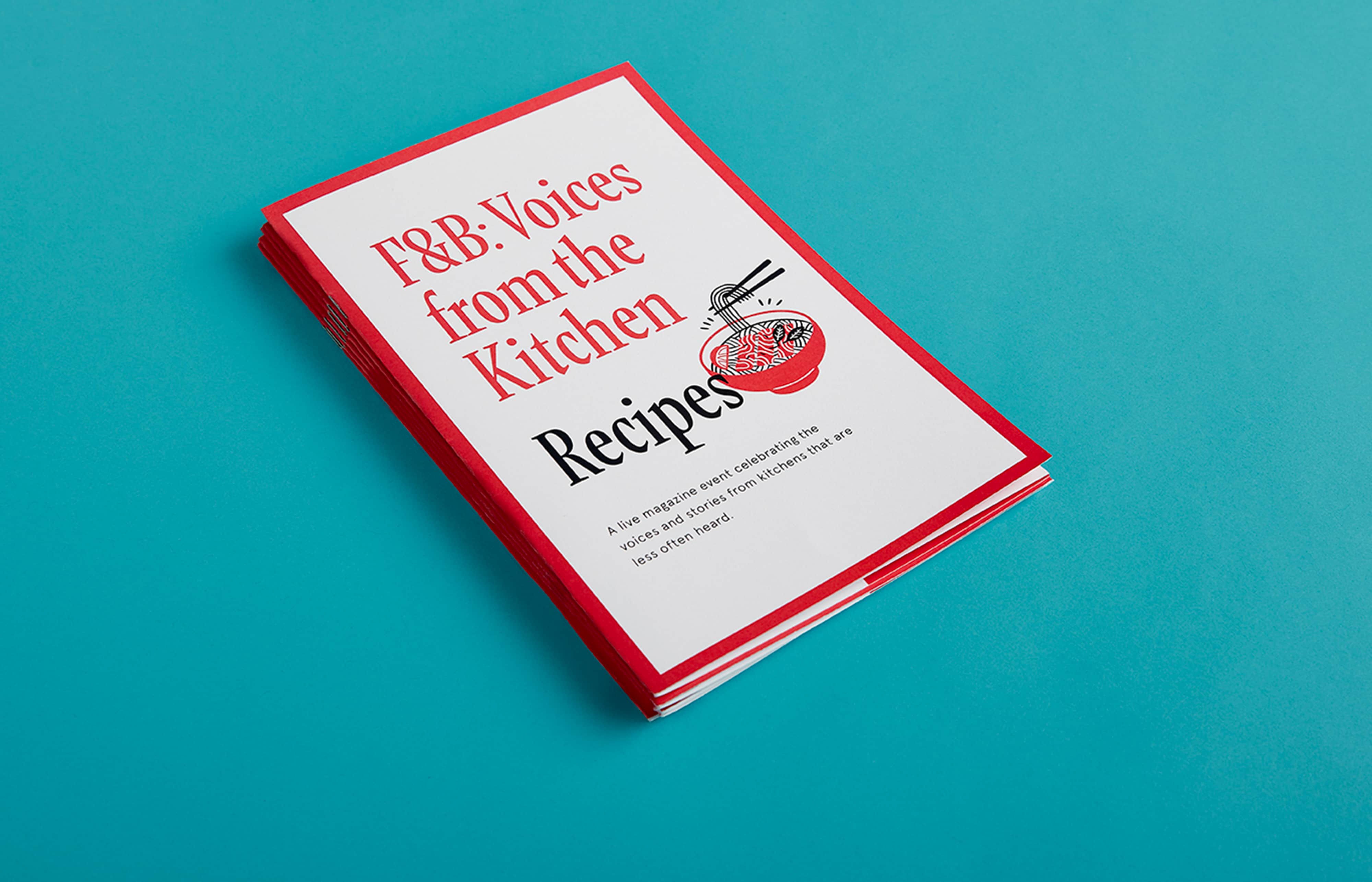
A live magazine event
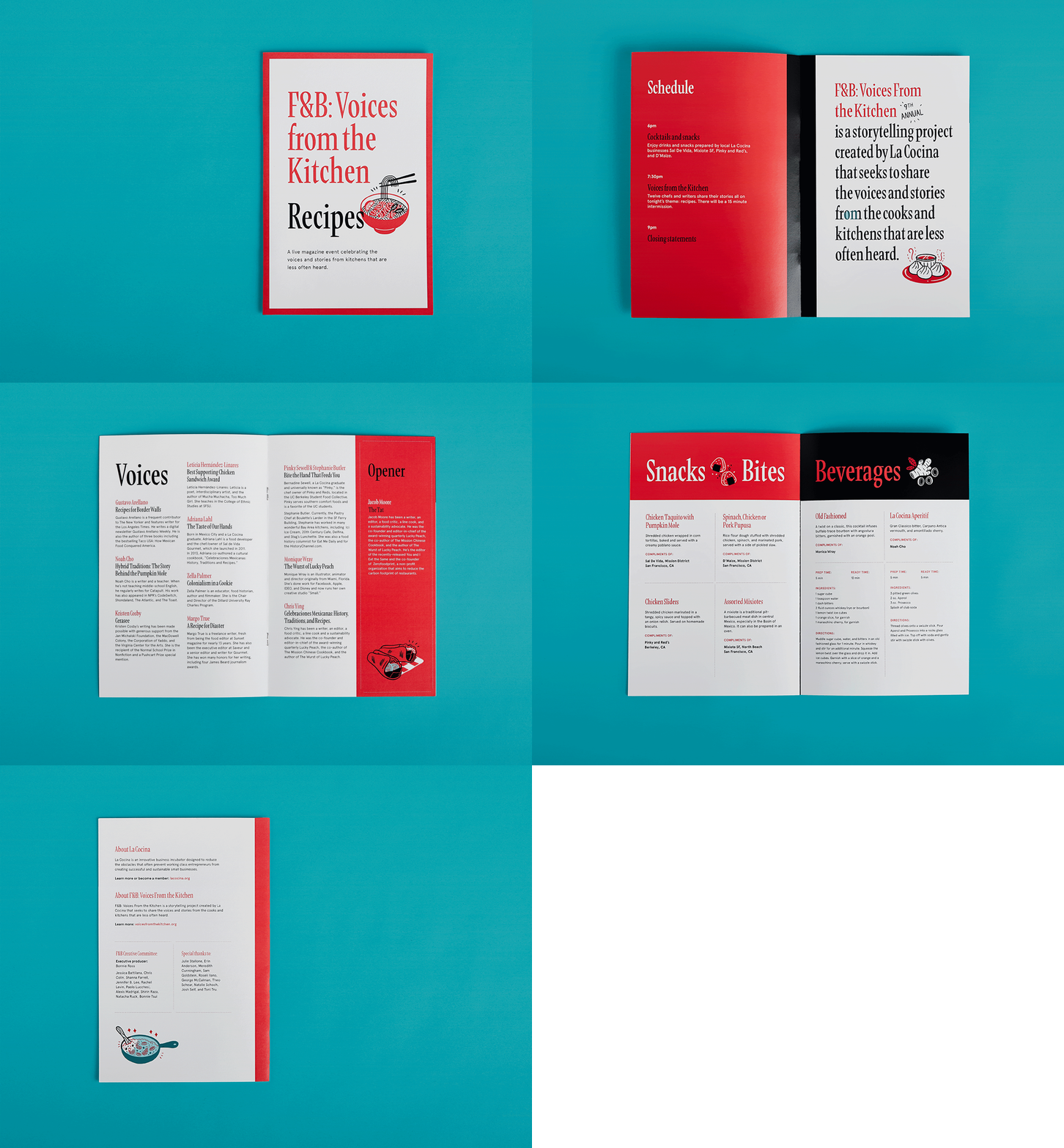
F&B: Voices from the Kitchen is a storytelling project created by La Cocina. It seeks to share the voices and stories from the cooks and kitchens that are less often heard. The event is a twice-yearly performance that revolves around (and includes) food and drink on a singular topic or theme.
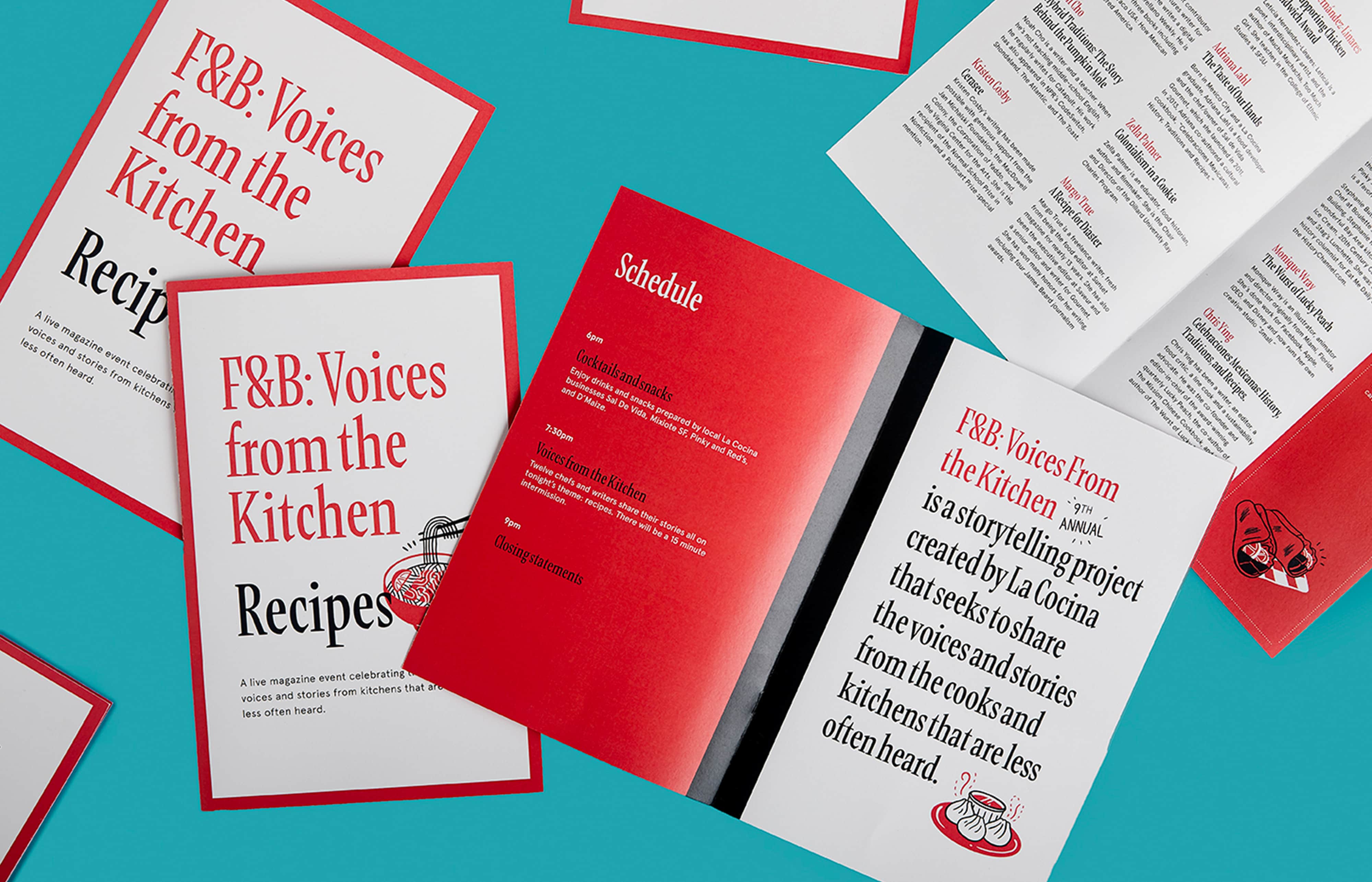
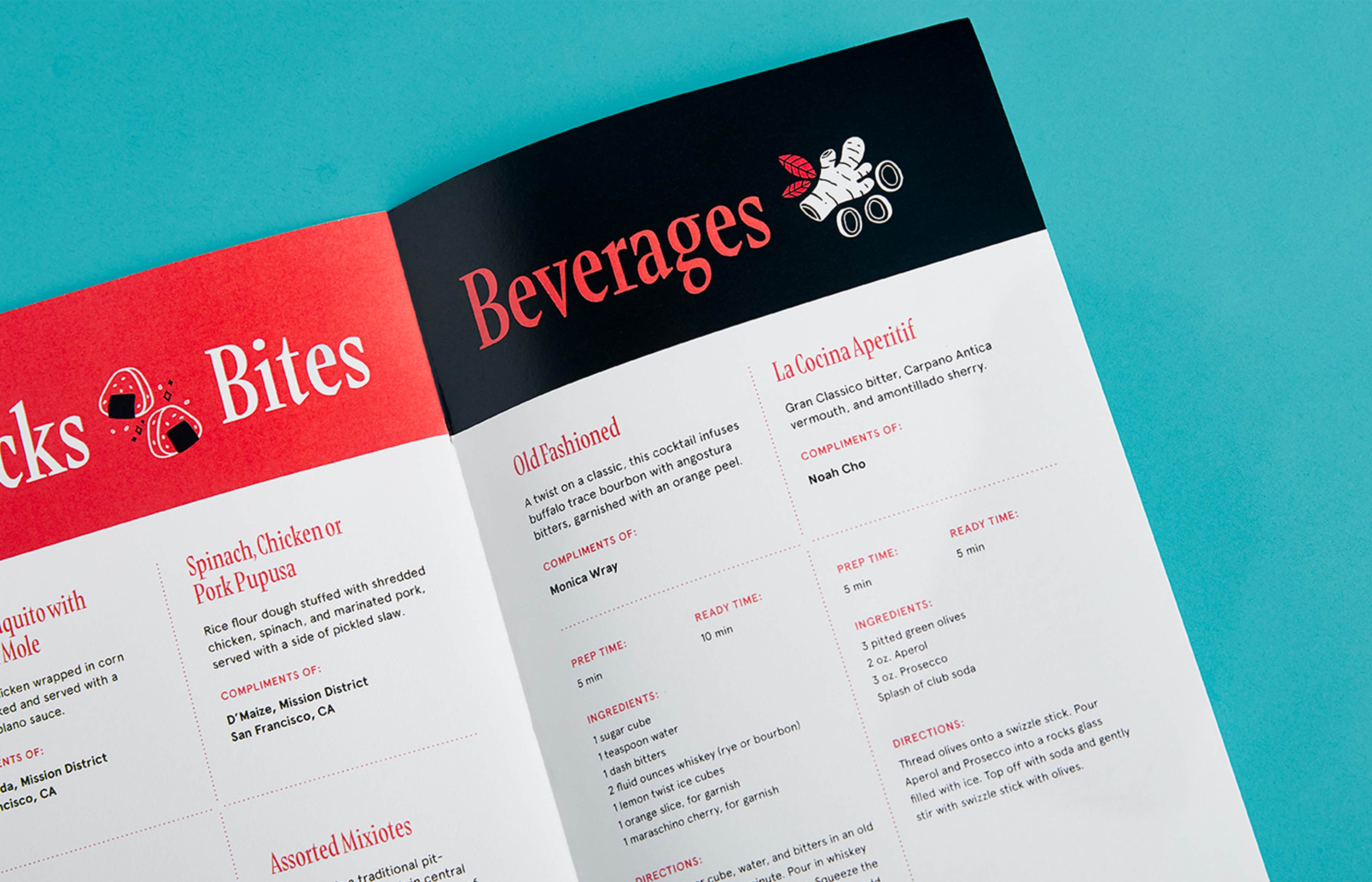
I worked with the F&B team to create an program for the show that outlined the night’s agenda, the event speakers, and the volunteer food vendors. The design was inspired by the event's theme—Recipes. I worked with the talented Ry Macaraya on the illustrations, providing content and art direction.
Credits:
Ry Macayara—Illustration
Bonnie Ross—Project manager
